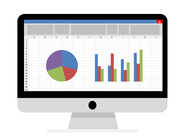
Create individual charts in Excel
As important as the number of figures is for decision-making and comparability, there’s nothing like a chart to show trends and trends as closely as possible.
Since Excel 2016 there are a lot of simplifications for us users, but there are always certain questions on how to customize and design the diagram.
1. Set the Data Source
1. Set the Data Source
Before we can even begin to create a diagram, of course, we need a data source from which the diagram is to be formed.
In our example, we have created a small table in which we have shown on the vertical axis 1 year (January – December), and on the horizontal axis fictional casinos with their monthly income.
In order to create a diagram from the available data, we proceed as follows:
- Mark the entire table
- Under the “Insert” tab, click the small arrow on the right in the “Diagrams” column to display all available diagram types
Note:
If you have a large table, you can mark it most quickly by placing it in the cursor in the 1st cell (top left), then holding down the “CTRL + SHIFT” key and then using the arrow keys on the keyboard 1x to the right , and then press down 1x.
This will only mark the area of a worksheet filled with content (without breaks).
See picture: (click to enlarge)
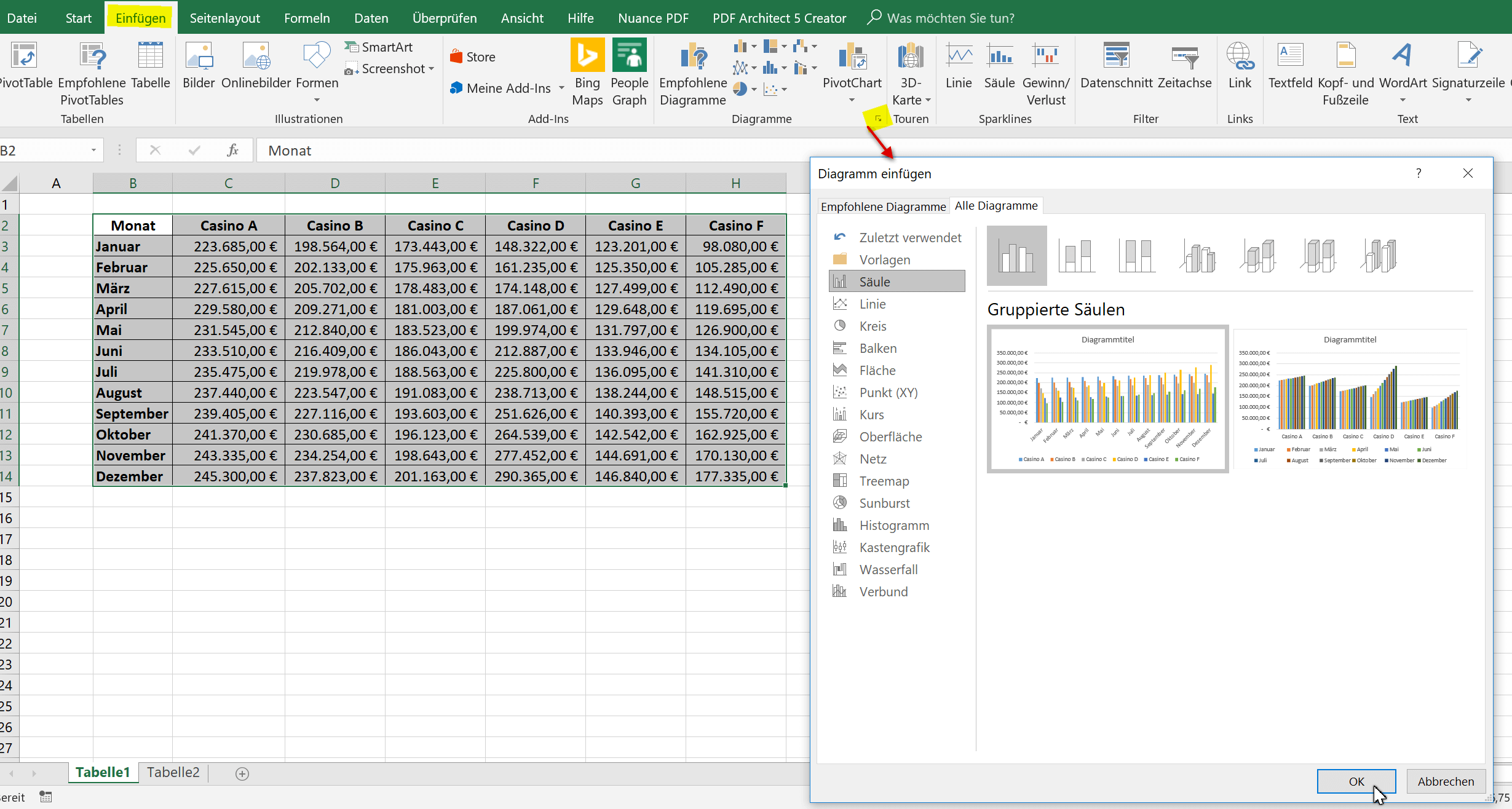
Here you can now choose from the available diagram types which are best suited for your presentation.
In our example, we opted for a classic bar chart. In retrospect, however, that can be changed again at any time.
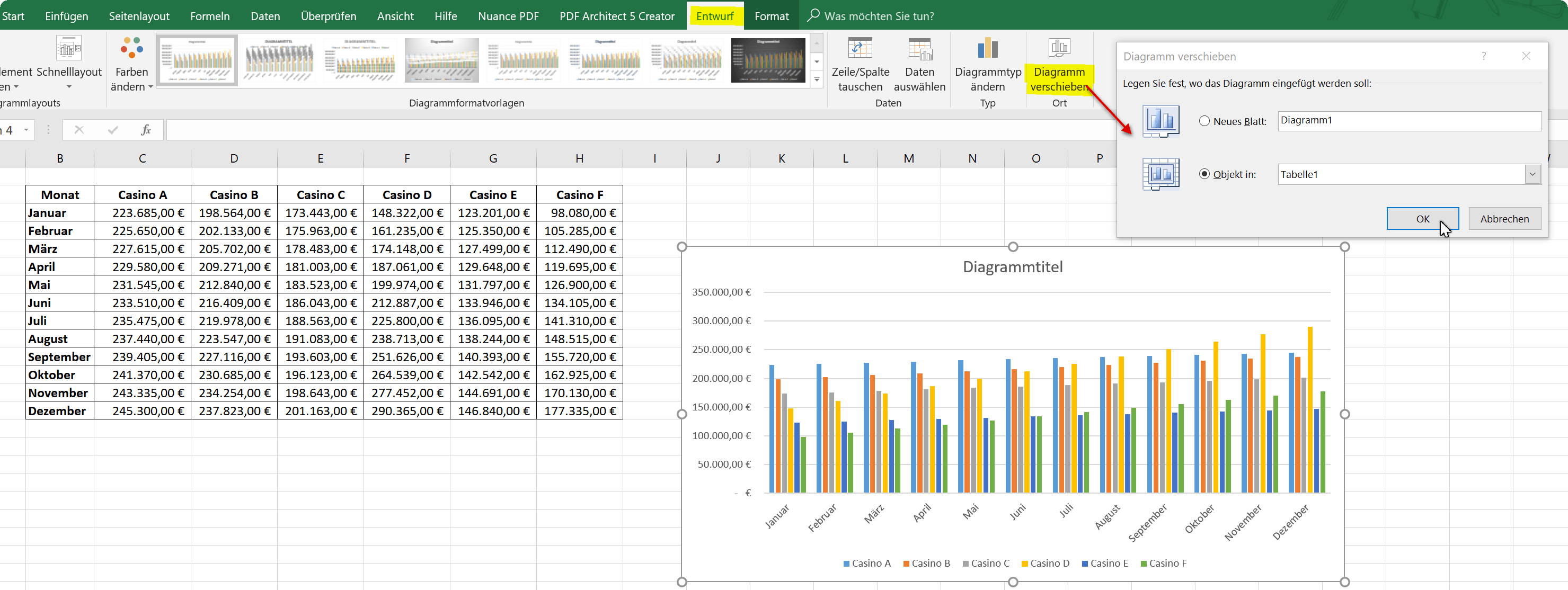
If you want to zoom in on the chart without having to scroll right and left with your mouse, you can easily move it to a new spreadsheet.
Note:
Of course, the data source will remain untouched, and it will not be a new spreadsheet, just an additional worksheet within a folder.
See picture: (click to enlarge)

Before we can even begin to create a diagram, of course, we need a data source from which the diagram is to be formed.
In our example, we have created a small table in which we have shown on the vertical axis 1 year (January – December), and on the horizontal axis fictional casinos with their monthly income.
In order to create a diagram from the available data, we proceed as follows:
- Mark the entire table
- Under the “Insert” tab, click the small arrow on the right in the “Diagrams” column to display all available diagram types
Note:
If you have a large table, you can mark it most quickly by placing it in the cursor in the 1st cell (top left), then holding down the “CTRL + SHIFT” key and then using the arrow keys on the keyboard 1x to the right , and then press down 1x.
This will only mark the area of a worksheet filled with content (without breaks).
See picture:
Here you can now choose from the available diagram types which are best suited for your presentation.
In our example, we opted for a classic bar chart. In retrospect, however, that can be changed again at any time.
If you want to zoom in on the chart without having to scroll right and left with your mouse, you can easily move it to a new spreadsheet.
Note:
Of course, the data source will remain untouched, and it will not be a new spreadsheet, just an additional worksheet within a folder.
See picture:
2. Limit the Data Source
2. Limit the Data Source
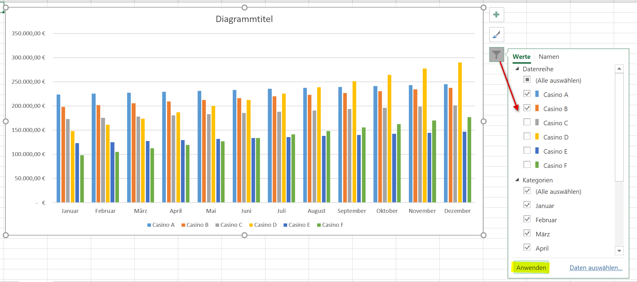
As our diagram looks like, it might just go that way, but you can see that the more column values on the X-axis have to be displayed at the same time, the more confusing it will be that too many colors are actually displayed.
But here, too, it has become much easier since Excel 2016 to specifically select individual values for comparison. So instead of having 6 casinos, we can compare only 3 with each other.
- To do this, we click once in an empty area of the diagram
- Select the filter icon from the context menu (to the right)
- Remove the hooks from the unneeded data columns
- Confirm with “Apply”
See picture: (click to enlarge)
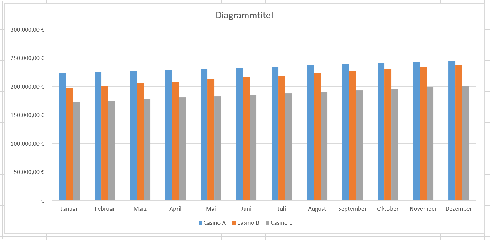
As a result, the matter is already much clearer, but on the other hand, of course, also more patchy. Because now we are missing the 3 remaining casinos. Here you can either proceed to simply create a second graph, or you can use the dynamic possibilities depending on which data should be compared.
Also, you can just try a different type of diagram (for example, line or pie chart).
As our diagram looks like, it might just go that way, but you can see that the more column values on the X-axis have to be displayed at the same time, the more confusing it will be that too many colors are actually displayed.
But here, too, it has become much easier since Excel 2016 to specifically select individual values for comparison. So instead of having 6 casinos, we can compare only 3 with each other.
- To do this, we click once in an empty area of the diagram
- Select the filter icon from the context menu (to the right)
- Remove the hooks from the unneeded data columns
- Confirm with “Apply”
See picture:
As a result, the matter is already much clearer, but on the other hand, of course, also more patchy. Because now we are missing the 3 remaining casinos. Here you can either proceed to simply create a second graph, or you can use the dynamic possibilities depending on which data should be compared.
Also, you can just try a different type of diagram (for example, line or pie chart).
3. Adjust axis and data labels
3. Adjust axis and data labels
Now we can customize the captions for the axes, the chart title and the data series in various ways.
To do this, we mark the part of the diagram we want to change, and then select data series or axis formatting from the context menu.
Also, here we can add or remove additional elements to our diagram, e.g. a data table, which offers itself here better than about a data directly above the data bar, because they would overlap again.
See picture: (click to enlarge)
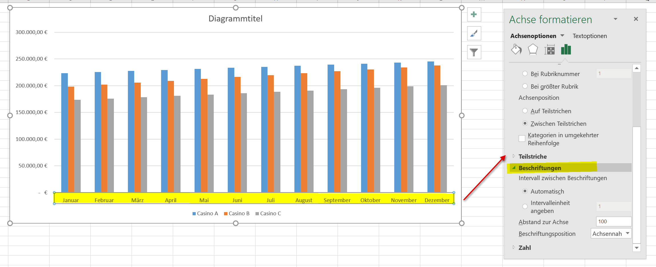
Of course, each chart can always be adjusted afterwards in all areas. Just select the appropriate area and use the context menu to select the desired customization.
Now we can customize the captions for the axes, the chart title and the data series in various ways.
To do this, we mark the part of the diagram we want to change, and then select data series or axis formatting from the context menu.
Also, here we can add or remove additional elements to our diagram, e.g. a data table, which offers itself here better than about a data directly above the data bar, because they would overlap again.
See picture:

Of course, each chart can always be adjusted afterwards in all areas. Just select the appropriate area and use the context menu to select the desired customization.
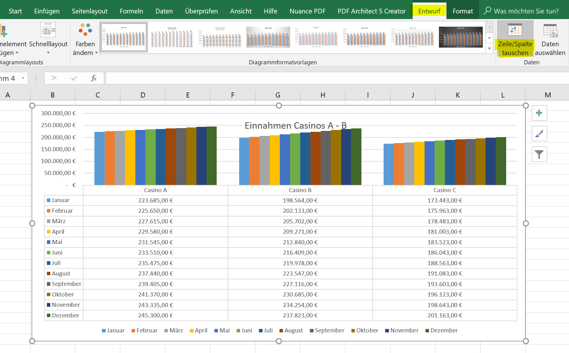
4. Reverse X-Axis an Y-Axis (transpose)
4. Reverse X-Axis an Y-Axis (transpose)
If you want to swap the X-axis (horizontal) and the Y-axis (vertical), there are 2 possibilities.
The first (and simplest) is simply to click the diagram in an empty area to make it completely mark, and then click on “Swap Row / Column” in the “Design” tab.
See picture: (click to enlarge)
The second option (a bit more involved) is to swap (transpose) the axes of the data source itself.
- To do this we go into our original table and mark it completely
- Then press “CTRL + C”
- Click in an empty area of the worksheet
- Select “Transpose” in the context menu under the paste options
After that, you must of course change the data source in the chart by clicking again in an empty area of the chart, and in the context menu “Select data”.
The result is then the same as described above for the axis inversion of the diagram.
See picture: (click to enlarge)
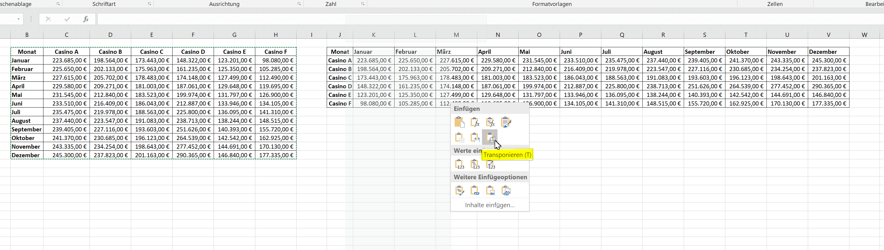
As you can see, it makes absolutely no sense to transpose the whole thing in our diagram, but it does not hurt if you know how it works, because maybe someday the need might be there.
If you want to swap the X-axis (horizontal) and the Y-axis (vertical), there are 2 possibilities.
The first (and simplest) is simply to click the diagram in an empty area to make it completely mark, and then click on “Swap Row / Column” in the “Design” tab.
See picture:
The second option (a bit more involved) is to swap (transpose) the axes of the data source itself.
- To do this we go into our original table and mark it completely
- Then press “CTRL + C”
- Click in an empty area of the worksheet
- Select “Transpose” in the context menu under the paste options
After that, you must of course change the data source in the chart by clicking again in an empty area of the chart, and in the context menu “Select data”.
The result is then the same as described above for the axis inversion of the diagram.
See picture:
As you can see, it makes absolutely no sense to transpose the whole thing in our diagram, but it does not hurt if you know how it works, because maybe someday the need might be there.
Popular Posts:

Ad-free home network: Install Pi-hole on Windows
Say goodbye to ads on smart TVs and in apps: Pi-hole software turns your Windows laptop into a network filter. This article explains step-by-step how to install it via Docker and configure the necessary DNS settings in your FRITZ!Box.

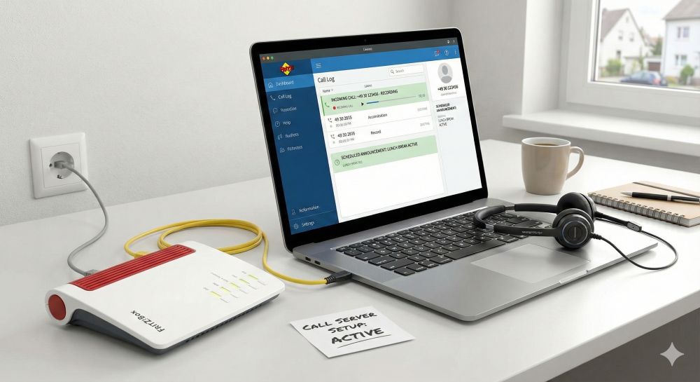
How to tune your FRITZ!Box into a professional call server
A professional telephone system can be built using a FRITZ!Box and a laptop. This article shows step by step how to use the free software "Phoner" to schedule announcements and record calls – including important legal information (§ 201 StGB).

Why to-do lists are a waste of time
Do you feel unproductive at the end of the day, even though you've worked hard? Your to-do list is to blame. It tempts you to focus on easy tasks and ignores your limited time. This article explains why lists are "self-deception" and why professionals use a calendar instead.

Smartphone Wi-Fi security: Public hotspots vs. home network
Is smartphone Wi-Fi a security risk? This article analyzes in detail threats such as evil twin attacks and explains protective measures for when you're on the go. We also clarify why home Wi-Fi is usually secure and how you can effectively separate your smart home from sensitive data using a guest network.

Warum dein Excel-Kurs Zeitverschwendung ist – was du wirklich lernen solltest!
Hand aufs Herz: Wann hast du zuletzt eine komplexe Excel-Formel ohne Googeln getippt? Eben. KI schreibt heute den Code für dich. Erfahre, warum klassische Excel-Trainings veraltet sind und welche 3 modernen Skills deinen Marktwert im Büro jetzt massiv steigern.

Cybersicherheit: Die 3 größten Fehler, die 90% aller Mitarbeiter machen
Hacker brauchen keine Codes, sie brauchen nur einen unaufmerksamen Mitarbeiter. Von Passwort-Recycling bis zum gefährlichen Klick: Wir zeigen die drei häufigsten Fehler im Büroalltag und geben praktische Tipps, wie Sie zur menschlichen Firewall werden.
Offers 2024: Word & Excel Templates


Popular Posts:
Ad-free home network: Install Pi-hole on Windows
Say goodbye to ads on smart TVs and in apps: Pi-hole software turns your Windows laptop into a network filter. This article explains step-by-step how to install it via Docker and configure the necessary DNS settings in your FRITZ!Box.
How to tune your FRITZ!Box into a professional call server
A professional telephone system can be built using a FRITZ!Box and a laptop. This article shows step by step how to use the free software "Phoner" to schedule announcements and record calls – including important legal information (§ 201 StGB).
Why to-do lists are a waste of time
Do you feel unproductive at the end of the day, even though you've worked hard? Your to-do list is to blame. It tempts you to focus on easy tasks and ignores your limited time. This article explains why lists are "self-deception" and why professionals use a calendar instead.
Smartphone Wi-Fi security: Public hotspots vs. home network
Is smartphone Wi-Fi a security risk? This article analyzes in detail threats such as evil twin attacks and explains protective measures for when you're on the go. We also clarify why home Wi-Fi is usually secure and how you can effectively separate your smart home from sensitive data using a guest network.
Warum dein Excel-Kurs Zeitverschwendung ist – was du wirklich lernen solltest!
Hand aufs Herz: Wann hast du zuletzt eine komplexe Excel-Formel ohne Googeln getippt? Eben. KI schreibt heute den Code für dich. Erfahre, warum klassische Excel-Trainings veraltet sind und welche 3 modernen Skills deinen Marktwert im Büro jetzt massiv steigern.
Cybersicherheit: Die 3 größten Fehler, die 90% aller Mitarbeiter machen
Hacker brauchen keine Codes, sie brauchen nur einen unaufmerksamen Mitarbeiter. Von Passwort-Recycling bis zum gefährlichen Klick: Wir zeigen die drei häufigsten Fehler im Büroalltag und geben praktische Tipps, wie Sie zur menschlichen Firewall werden.
Offers 2024: Word & Excel Templates