Create Excel Budget Book – with Statistics – Tutorial
Would you like to create a household book in Excel, in which you can display your inputs and expenses over different periods not only as a table, but also in a graphic overview? Then you are exactly right here. We explain step by step how you can create your own budget book with Excel.

Building an intelligent table
Building an intelligent table
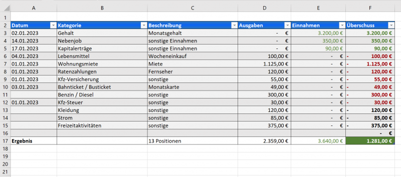
First, let’s start building a smart spreadsheet in Excel. Make the entries in columns A-F: Date, Category, Description, Income, Expenses and Surplus. In the second step, select the cell range A1-F2.
- Then, on the Insert tab, click Table
- Your selected cell range is already entered in the following small dialog window
- Below that, check the box “Table has headings“
- You will now be automatically redirected to the “Table Design” tab
- In the right pane you will find pre-formatted “Table Styles” to choose from, or you can create a custom template that suits you better.
- In the “Table format options” area on the left, I recommend leaving the “Filter, Header and Banded rows” checked.
With this you have created a good basis for all further steps. You can find out more about intelligent tables / dynamic tables here >>>
In our example, we have already filled this table with some data and categories for income and expenses.
see fig. (click to enlarge)
Create dropdown list in Excel
Create dropdown list in Excel
Now, this table gets longer and longer over time as you add more entries. And maybe you’ll enter the term “income” or “wage” instead of “salary” at some point. Which in the end means nothing else, but will make the evaluation more difficult and confusing. And that becomes particularly important with regard to the graphic representations!
So we did it in such a way that we created another intelligent table in a new spreadsheet. As a kind of help worksheet, so to speak. However, this table only needs a single column for which we assign the heading “Categories“. Here, too, we mark the cell in which the term “Category” is located, and the cell below it together. Next, let’s create another smart table right away, as described above.
The advantage of intelligent tables is that Excel knows that this is a table (and therefore also a delimited area), and thus enables different options at the same time. So that we don’t get confused with our categories, we put the categories we want in our new table. To jump to the next cell below, simply press the “TAB key” on the keyboard. This automatically expands the table by this area.
After that we proceed as follows:
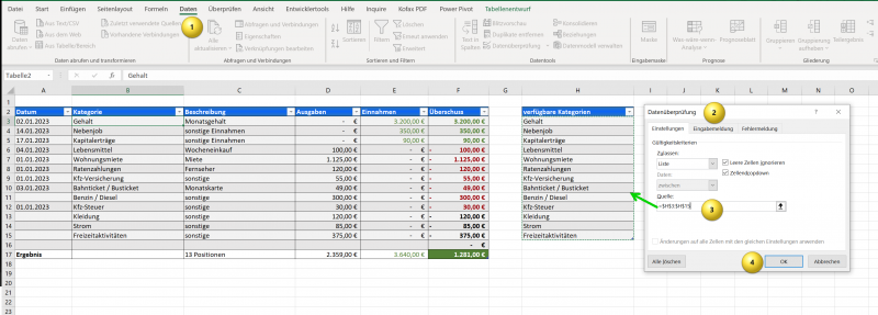
- In the table with the income, expenses, etc., mark the table column “Category“
- Then click on the “Data” tab and then on “Data Validation“
- Under “Eligibility Criteria” select “List“.
- Then click in the “Source” field and next go to your worksheet with the intelligent table “Categories” and mark the table column
- We leave the checkboxes “Ignore empty cells” and “Cell dropdown” checked. This makes it easier later to simply select the correct terms from a drop-down list
- Confirm with “OK“
see fig. (click to enlarge)
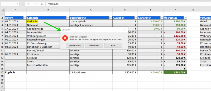
So that we can now do this really well, we are also setting an individualized error message that should appear if someone decides not to select from the drop-down list but to enter text in the cell that is not permitted.
- Highlight your “Category” column in the large table again
- Go to data verification again and select the “Error message” tab
- Here you can write in what you want to see who makes an incorrect entry
see fig. (click to enlarge)
So far so good. The steps we have taken so far form the basis for everything else.
By the way: Please don’t forget to format your columns appropriately. I.e. wherever there are amounts later, I recommend formatting this column as a currency with two decimal places, and the date etc. should of course also be formatted correctly. If you looked at the screenshots and wondered why negative values in my table are in red font and positive values in green font, I recommend you to take a look at the conditional formatting. You don’t do that manually, of course, but let Excel do it for you. We also have an article in our portfolio that goes into more detail about conditional formatting in Excel.
If you are interested in more about cell formatting / number format codes and how to customize them, please read our article here >>>
Create Pivot Table & Pivot Chart
Create Pivot Table & Pivot Chart
We have already entered a few fictitious categories and values for income and expenditure in the example table of our household book. This table will now serve as a basis for us to create several pivot tables and then use them to create graphical pivot charts that automatically adapt to every change in the main table.
Furthermore, we will also insert a data slicer in the following, which will help us to narrow down our data better in order to make only partial areas visible according to selected criteria.
So let’s start with the first pivot table:
- It is best to create a new spreadsheet which you could call “Data Analysis” as in our example
- Then, on the Insert tab, click Pivot Table
- The first item in the following dialog window is “Select table or range“. Here you click in the input field, then switch back to the worksheet with your main table and mark it by left-clicking in the upper left corner of the intelligent table
- You will see that the entire table (except for the header row) is highlighted. That’s how it should be!
- Switch back to the spreadsheet with the “Data Analysis” and mark e.g. cell A1 where we want to create the first pivot table
- Next, on the right side, there is a window that we want to include in our report
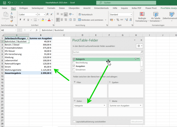
- Here we drag the outputs into the “Values” box and the categories into the “Rows” box
see fig. (click to enlarge)
You can find out more about pivot tables and pivot charts here >>>
At this point it also becomes clear why it is important that we work with intelligent tables. Because we have assigned a fixed selection of data to our Pivot Table as the data source. However, since the reference area of an intelligent table is automatically expanded with each entry, this is also reflected in the result in the data of the pivot table. In the pivot table filter, I recommend setting the “Value filter” to “Greater than 0” so that empty values don’t make the whole thing too confusing.
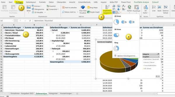
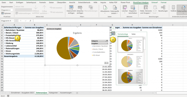
In the first report, we simply compared the “expenditure” to the “categories” so that we know which areas have the largest expenditure items. In order to generate a pivot chart (i.e. a graphic representation) from this, we proceed as follows:
- Click in any cell in your pivot table
- Then go to “Charts” from the “Insert” tab
- Here you can choose between recommended diagrams, or choose from a variety of templates yourself
- You can make the design adjustments by clicking in the diagram and then using the corresponding icon to select a design template or create your own
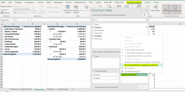
By default, filter buttons are always implemented in a newly created chart. If you don’t need them, for example because you work with separate slicers or other filters (we’ll get to those later), you can also hide them.
- Click in your Pivot Chart, and then click “Pivot Chart Analysis” under the tab
- If not already displayed, activate the “Field filter” on the right side
- Here you now click on the drop-down menu in the report filters and simply hide the buttons in the pivot chart
see fig. (click to enlarge)
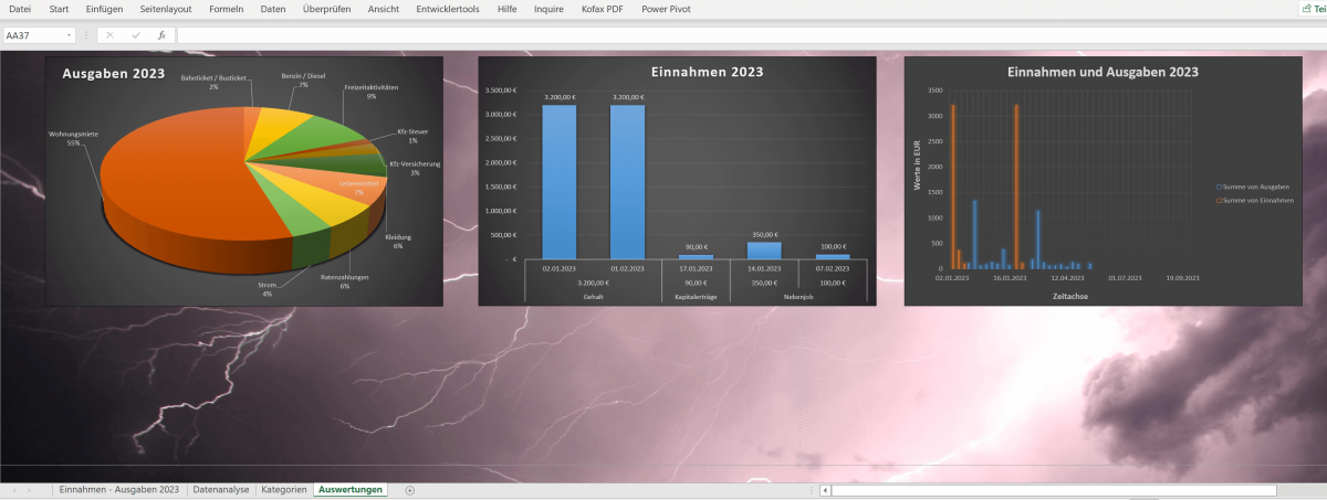
Now we have already created a Pivot Chart (graphic diagram) from our first Pivot Table (tabular representation). And all this data is based on our main table with the income, expenses, categories, etc. Next, I recommend that you create another spreadsheet, and maybe name it “Evaluations” like in my example so that you don’t lose track of what’s behind which spreadsheet hides what.
In the end, after a few small visual adjustments, it could look like this in the next intermediate step.
(click to enlarge)
Insert timeline and slicer
Insert timeline and slicer
In our example, we would now also like to add a data slicer that we can use to filter the pivot charts we created previously in our “Evaluations” worksheet. The data section of a pivot table is ideal for this.
- Click into one of your pivot charts
- Then go to Pivot Chart Analysis
- Next click on “Insert Slicer“
- In the following window you can select all available data based on the Pivot Table according to which you want to use filters
- You can change the visual adjustment by clicking on the field with the slicer filters and then going to “Slicer Styles” in the “Slicer” tab.
- Depending on the color of the rest of the spreadsheet with the evaluations, you will find something suitable in the templates, or you have the option of completely adapting the look to your own ideas.
In the example image below, we have used a slicer filter for the categories and one for the months. You only need to select one or more fields of the categories and, if necessary, the desired months. Depending on which filter you select via the data slicer, the pivot chart will adapt itself automatically.
PS: In my example, a few months are not yet highlighted in color in the data section because I have not yet entered any values for these periods in the main table with my income and expenses. Of course, this changes automatically the more your Excel budget book fills up.
see fig. (click to enlarge)
We hope that we can help you with our little tutorial and inspire you to experiment. Of course, the possibilities that we have shown here are only a fraction of what is really possible with the Excel tools Pivot Table, Pivot Chart and Data Slicer.
It is important that you have already understood the basic functionality and can then build your Excel budget book according to your own ideas.
Popular Posts:
With the webcam to your dream job: Preparation for the video job interview!
Streamline your video interview with our tips on technique, setting, dress, body language and preparation. It's not quite success from the sofa, but this is where you can prove your professionalism.
IT security: The deceptive appearance of digital security
In a digitized world, IT security is an important factor. But technology alone is not enough. A holistic strategy is needed that also takes into account the human component.
Import Stock Quotes into Excel – Tutorial
Importing stock quotes into Excel is not that difficult. And you can do a lot with it. We show you how to do it directly without Office 365.
Create Excel Budget Book – with Statistics – Tutorial
Create your own Excel budget book with a graphical dashboard, statistics, trends and data cut-off. A lot is possible with pivot tables and pivot charts.
Excel random number generator – With Analysis function
You can create random numbers in Excel using a function. But there are more possibilities with the analysis function in Excel.
Excel Database with Input Form and Search Function
So erstellen Sie eine Datenbank mit Eingabemaske und Suchfunktion OHNE VBA KENNTNISSE in Excel ganz einfach. Durch eine gut versteckte Funktion in Excel geht es recht einfach.

